
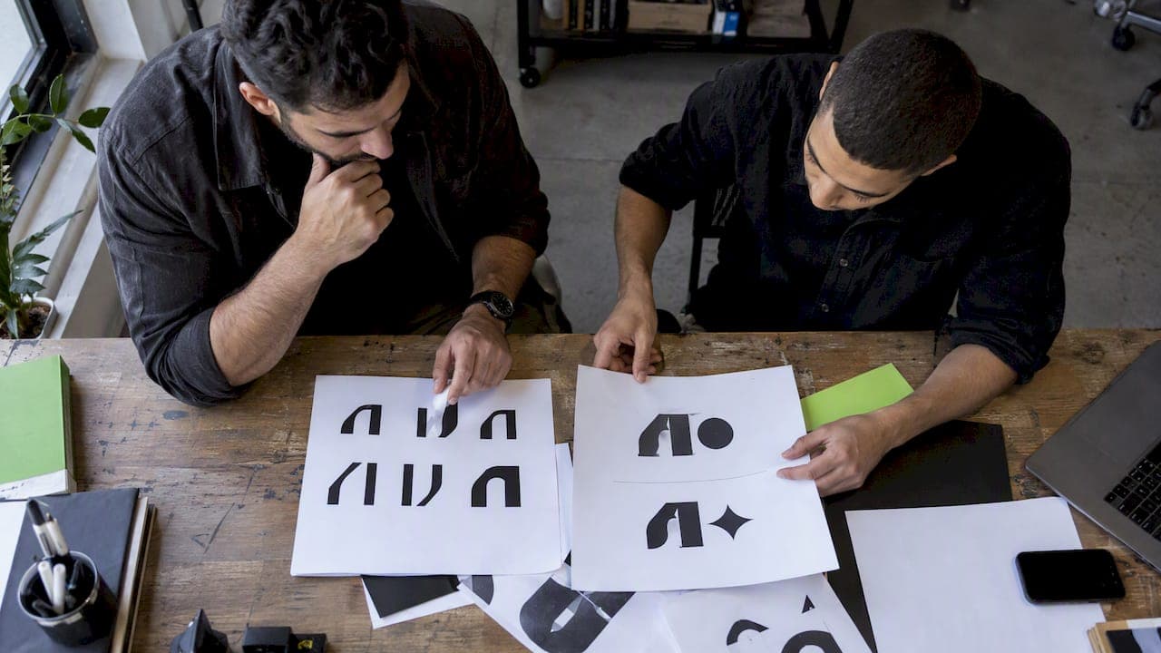
A logo is any visual mark that identifies a brand, from a symbol to a monogram to a full lockup. A wordmark, sometimes called a logotype, is a text-only logo that uses typography itself as the identifying device. The decision rule is simple: pick a wordmark when the name must be read and remembered instantly, and pick a symbol or combination mark when you need a visual shorthand that can outlast the written word.
TL;DR:
- Long or hard to pronounce names often work better as initials or a symbol, while short, distinctive names can carry a wordmark alone.
- Test every mark at its smallest real use, especially favicons measuring 16 pixels, because full wordmarks can blur while symbols and lettermarks remain legible.
- Ask for hand adjusted letter spacing, a condensed version, an icon version, vector files, color specifications, and usage rules before approving a design.
- Registering the name as a standard character mark protects wording across fonts and colors; a special form filing covers only the submitted visual treatment.
Table of Contents
- What counts as a logo?
- What is a wordmark and how does it work?
- Logo types compared at a glance
- When to choose a wordmark versus a symbol or combination mark
- Design guidance for building a strong wordmark
- A quick checklist before you commit to a direction
- Trademark basics: protecting a wordmark
- Why most wordmark advice undersells typography
- How our studio approaches wordmarks and product identity
- Where to go from here if you need a full identity system
- FAQ
- Sources
What counts as a logo?
"Logo" is the umbrella term for any visual asset a brand uses to identify itself, and it covers several distinct formats rather than one fixed look, according to Simple English Wikipedia's entry on logos. The main types include the symbol or brandmark (a standalone icon with no text), the wordmark or logotype (the name rendered in custom type), the lettermark or monogram (initials, like an acronym treated graphically), the combination mark (a symbol paired with text), and the emblem or badge (text enclosed inside a shape, common for schools, government bodies, and heritage brands).

Each format carries its name recognition differently. A symbol asks an audience to learn an abstract association before it means anything. A combination mark lets a business lean on the symbol once the name is established, then drop the text for shorthand use. An emblem signals tradition and permanence, which is why it shows up on seals and institutional marks more than on tech startups.
It helps to separate "logo" from "brand identity." A logo is one asset. Brand identity is the full system, color palette, typography, imagery, voice, and the rules that keep all of it consistent across touchpoints. A strong wordmark or symbol only pays off when the rest of that system supports it.
What is a wordmark and how does it work?
A wordmark is a logo built entirely from the brand's name set in distinctive type, with no separate icon or symbol doing the identifying work. Everything rides on the letterforms themselves: the typeface, the spacing between characters, the weight, and often a signature color become the visual shorthand people learn to recognize, a pattern you can see across examples in Vanderbilt University's brand identity guide.
The appeal is immediacy. A wordmark tells the audience exactly who they are dealing with the first time they see it, with no decoding step required. That makes it a practical choice for a business that needs to build name recognition fast and without a large marketing budget behind an abstract symbol.
The tradeoff is that a wordmark lives or dies on its typography. Research on brand name recognition found that people encode the surface details of a wordmark, including font and letter case, as part of how they remember it, and that identification slows when those details change, according to a 2024 study on visual word identification in brand names. That means a weak or generic typeface choice weakens the entire mark, and a name that is especially long or hard to pronounce can make a wordmark feel cluttered at small sizes.

Logo types compared at a glance
The right format depends less on taste and more on where and how the mark needs to perform.
- Readability: wordmarks win when the name itself needs to register instantly; symbols win once an audience already associates the shape with the brand.
- Memorability per dollar spent: a wordmark can be memorable from day one if the name is distinctive, while a symbol typically needs sustained exposure before it sticks.
- Scalability across touchpoints: symbols and lettermarks hold up better at tiny sizes, like a favicon or an app icon, where a full wordmark can turn to mush.
- Name length and pronunciation: short, distinctive names make strong wordmarks; long or hard-to-pronounce names often shift the burden to a symbol, lettermark, or combination mark instead.
A combination mark tries to capture both advantages at once, pairing a readable name with a scalable icon that can stand alone once recognition builds.
When to choose a wordmark versus a symbol or combination mark
The right call usually comes down to business stage, name, and how the brand shows up day to day.
- Early-stage and descriptive-name businesses benefit from a wordmark because the name is doing double duty as a product description, and clarity matters more than iconography at launch.
- SaaS and e-commerce brands often lean on wordmarks in their product UI, since navigation bars, login screens, and email footers all reward instant legibility over abstract symbolism.
- Consumer goods, apps, and games more often invest in a symbol or combination mark, because a small icon needs to work on a phone home screen or a shelf label where a full name would be unreadable.
- Long or technical names frequently shift toward a lettermark or monogram, trading the full name for initials once the brand is established enough that an abbreviation still communicates.
- Budget and timeline favor wordmarks in the short term: a well-typeset name, properly kerned and paired with a solid color system, can be production-ready faster and cheaper than developing an original symbol from scratch.
None of these are fixed rules. A business can start as a wordmark and introduce a companion symbol later, which is common once a name has enough market recognition to carry an icon on its own.
Design guidance for building a strong wordmark
A wordmark succeeds or fails on a handful of typographic decisions, and getting them right up front avoids expensive revisions later.
- Choose a typeface that matches the brand's position, not the current trend. A font associated with a "lover" archetype (organic, script-like letterforms) reads very differently from one suited to a "ruler" archetype (tight, formal, geometric type), and research on typeface and brand archetype backs that mismatch risk, per a De La Salle University study on typeface and perceived brand archetype.
- Adjust kerning and letterforms by hand rather than trusting the default spacing in a retail font. Many strong wordmarks start from a licensed typeface and then get custom-drawn tweaks to specific letters so the name reads cleanly as a unit, not as separate characters.
- Check weight and contrast at small sizes. A wordmark that looks sharp at business-card size can blur into illegibility on a mobile favicon, so test it at the smallest size it will realistically appear.
- Treat color as a functional choice, not just an aesthetic one. Hue, chroma, and value all affect how trustworthy and clickable a wordmark appears in digital contexts, so test real color options in the environments where the mark will actually live before locking a palette.
- Build a full responsive lockup set. That means a primary wordmark, a condensed version for narrow spaces, an icon-ready mark if a companion symbol is planned, and a simplified favicon version that still reads at 16 pixels.
Pro Tip: Ask your designer for vector master files, SVG exports at multiple sizes, documented hex and Pantone color values, and minimum-size and spacing rules, so every team that touches the brand later works from the same source.
For a deeper look at how early branding decisions ripple through a growing company, our piece on branding choices for technology startups walks through what to prioritize when budget is tight and speed matters.
A quick checklist before you commit to a direction
Before signing off on a wordmark, a symbol, or a combination mark, run through a short set of questions with whoever is designing it.
- Does the audience need to recognize the name itself, or will a visual shape serve the brand better over time?
- Where will the mark appear most: a website header, a mobile app icon, product packaging, or signage?
- Is the name distinctive enough to stand alone, or does it risk blending in without a visual anchor?
- Does the budget and timeline support custom type work, or would a well-executed wordmark get to market faster?
Watch for a few warning signs in any proposal: a mark that was never tested at favicon size, no responsive or condensed versions delivered, or a design leaning heavily on a trending font that will look dated within a couple of years. A solid deliverable package includes vector files, color specifications, and spacing rules, with acceptance tied to how the mark performs across your real touchpoints, not just on a presentation slide.
Trademark basics: protecting a wordmark
Once a wordmark is finalized, registration choices affect how much protection it actually carries. A standard character filing protects the wording itself, independent of font, style, or color, while a special form filing protects one specific stylized depiction, according to USPTO guidance on trademark drawings. Many businesses register both: the standard character version to lock down the name broadly, and the special form version to protect the exact visual treatment currently in use.
That choice affects future flexibility. A standard character registration lets a brand update its typeface or color later without losing protection on the name, while a special form registration ties protection to the specific look filed. Broader guidance from the WIPO guide to trademarks and brands notes that marks can take many forms, words, logos, colors, or combinations, and that registering multiple elements separately often gives stronger coverage overall. The practical next step is a conversation with a trademark attorney or a filing through your national trademark office, since requirements and strategy vary by jurisdiction.
Why most wordmark advice undersells typography
Most guidance on logos versus wordmarks treats the choice as a branding exercise, something settled in a mood board and then handed off. That undersells how much of a wordmark's performance comes down to typographic engineering rather than taste. A well-chosen typeface with sloppy kerning will underperform a plain typeface that has been carefully tuned, because recognition research shows people encode the surface details of a name, not just its letters, as part of how they remember a brand, per the 2024 study on brand name recognition.
We also think too many brands treat the wordmark as a one-time deliverable instead of a living system. A name that works beautifully at 72 points on a homepage often falls apart at 16 pixels in a browser tab, and that gap gets discovered only after launch, when fixing it is expensive. For real guidance on lockups and usage rules across formats, NEXTmsp's brand guidelines show how a disciplined system handles those variations without losing consistency. The businesses that get the most out of a wordmark are the ones that budget for a full responsive system up front, not just a single polished file.
— Amal
How our studio approaches wordmarks and product identity
Our design and development work happens under one roof, which means the people drawing a wordmark are often the same people building the interface it will live inside. That matters because a wordmark rarely works in isolation: it has to sit next to navigation icons, buttons, and UI color systems without fighting them for attention. We recommend testing a wordmark directly inside real screens, not just on a brand board, before locking a final version.
A specialist typographer is the right call when a business only needs the mark itself. A full-service studio makes more sense when the wordmark has to integrate with a product's UI and interaction design from day one, since naming, iconography, and interface decisions tend to shape each other as a product grows.
Where to go from here if you need a full identity system
If your wordmark needs to work across a website, a mobile app, and a product interface at once, we build that as one connected system rather than separate handoffs between vendors. Our branding and logo design work covers typography, lockups, and color systems, and it pairs directly with our UI/UX design and prototyping services so the mark and the product ship in sync.
A typical starting engagement looks like this:
- A discovery conversation to map your name, audience, and where the mark needs to perform first.
- A typography and lockup phase producing your primary wordmark, condensed version, and icon-ready treatment.
- Delivery of vector masters, color specs, and spacing rules your team can hand to any future vendor.
If you are also planning the product the wordmark will live inside, a custom web application or a mobile app build) can start alongside the identity work rather than after it. Reach out through our services page to talk through what a starter engagement would look like for your brand.
FAQ
What are 7 types of logos?
Common logo categories include the wordmark (logotype), lettermark (monogram), symbol or brandmark, combination mark, emblem or badge, mascot, and abstract mark. Each functions differently, a wordmark leads with the name while a symbol or mascot leads with imagery, so the right type depends on the brand's stage and where it needs to appear.
What is meant by wordmark?
A wordmark, also called a logotype, is a text-only logo that uses the brand's name set in distinctive typography as its sole identifying device, as described by Simple English Wikipedia. It relies on typeface, spacing, and often color rather than a separate icon or symbol.
What's a wordmark vs. a trademark?
A wordmark is a design asset, the visual rendering of a brand name in specific type. A trademark is a legal registration that can protect that name as a standard character mark, covering the wording regardless of font, or as a special form mark, covering one specific stylized version, per USPTO guidance.
What are the three types of logos?
A simplified way to group logos is text-based (wordmarks and lettermarks), symbol-based (brandmarks and abstract marks), and combination marks that pair text with a symbol. Most brand identity systems fall into one of these three groups, even when the specific style within each varies widely.
Sources
- Logo — Simple English Wikipedia
- Drawing of your trademark — USPTO
- Visual word identification beyond common words: The role of font and letter case in brand names (2024)